C o l o u r
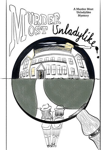
Following my research and whilst developing the illustration, I knew I needed to create a cover that would stand out on a bookshelf. But I also wanted to ensure I created something that was in sync with the demographic. I found myself avoiding traditional primary colours but inadvertently found it was looking too dark, dull from a distance and lacking impact.
I realised that the background needed colour. I felt it would be an interesting contrast if it was a daytime sky in the background and a night time scene within the magnifying glass. I felt it symbolised the darkness and mystery behind the cheerful, presentable public version of the school. It was also apt as much of Daisy and Hazel's investigations would happen on an evening, under a cloak of darkness.
I intentionally used warm toned colours in the background and cool tone colours within the magnifying glass, to further emphasise the contrast between day and night, as well as add visual impact and interest.
background: blue sky #8cbcfa ; green grass #dbebaa ; brown handle #b58e53
typography: yellow glow #fceb9b ; black #000000
magnifying glass: school #738498 ; sky #1d1e3a ; moon #fceb9b
For the back cover I looked at wrapping the background right round, however I felt it distracted from the wooden window illustration. I decided to fade out the colour wash gradually into a white, which keeps it clean and no visual clashes. With the amount of text on the back, I think keeping things paired back allows for clear communication and for the different elements to shine in their own right.
I additionally chose to colour the book page edges in black, so it contrasts with the light cover boards.
C o m p o s i t i o n
Much of my typography and composition choice was determined by the placement of the magnifying glass and hierarchy. The magnifying glass needed to take as much real estate on the page, as I wanted the viewer to feel like they are physically looking through the glass, plus I wanted the caption 'There's been a rather shocking murder at Deepdean School for Girls...' to be legible. As a result the text, particularly the title, circumvents around the circle of the glass, so it reads as secondary to the main illustration, whilst retaining its own sense of interest.
I chose to combine the M in Murder Most as a means of drawing the eye down, as well as create an overall balance of the page- the M anchoring the top left and the handle of the magnifying glass anchoring the bottom right.
T y p o g r a p h y
I initially used Rockwell and Chalkduster fonts for the title. Rockwell as it reminded me of typewriters and police case files. and Chalkduster in reference to school chalk writing, however I didn't like how 'perfect' it was looking. I wanted type that was hand drafted and had an organic aesthetic. I traced the Rockwell text by hand for 'Murder Most' and for 'Unladylike' I referred back to traditional cursive writing that I was taught in school. I made a mistake by accidentally drawing a clump at the end of the word, however I felt it was in keeping with what I was trying to achieve, so it was kept.
I also used Photoshop to play around with distortion of the text, emulating the effect a magnifying glass. The combination of two different type choices further emphasises contrasting elements - dark and light, day and night, warm and cold, and now masculine and feminine typeface.